PAVUŠA
Packaging Design · Art Direction · Visual Identity
Challenge
Pavuša was created as a personal tribute to Pava, the winery owner’s wife. The challenge was to translate an intimate story, and her love of flowers into a wine label that felt personal without becoming sentimental, while still carrying the presence and sophistication expected from a premium wine.
Solution
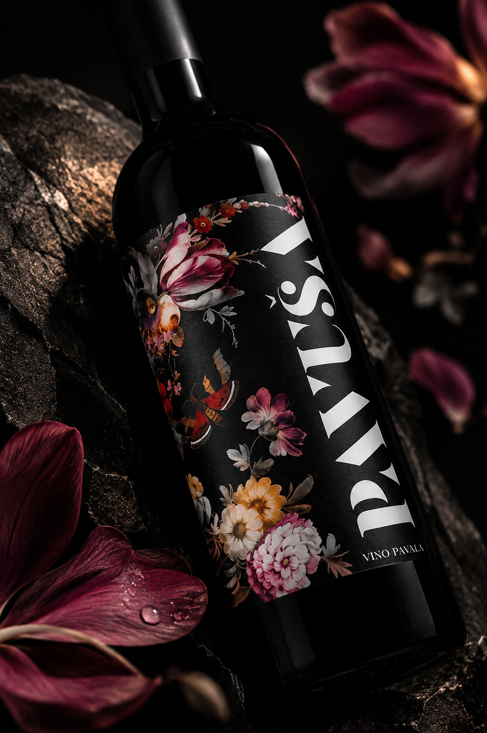
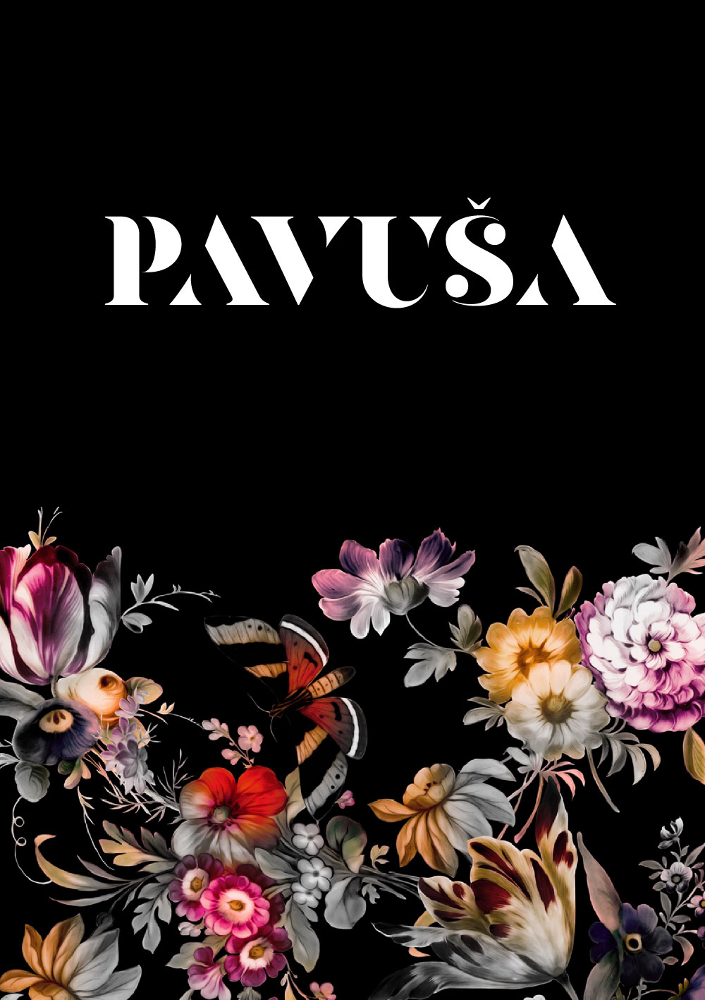
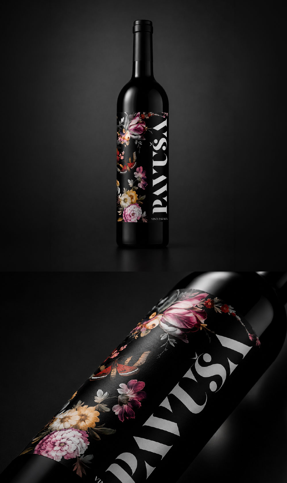
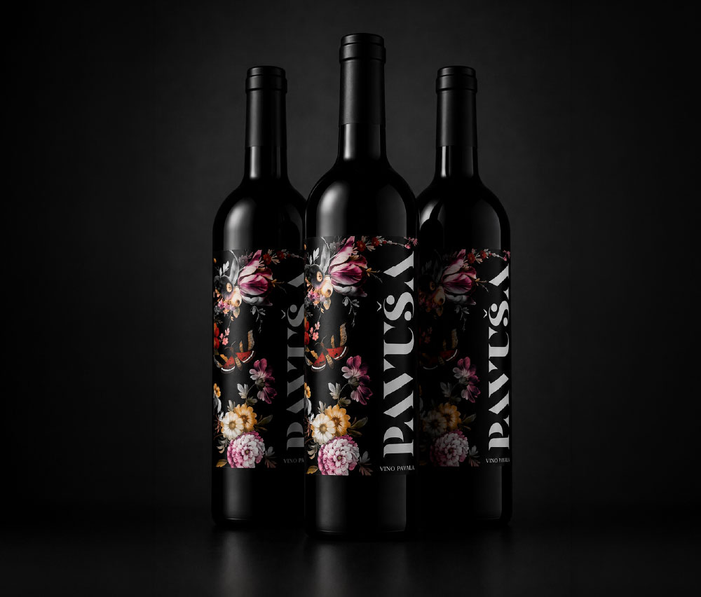
The identity was built around a rich botanical composition, using flowers as the central storytelling element rather than simple decoration. Set against a dark background and contrasted with expressive typography, the floral artwork creates a balance between romance and sophistication, giving Pavuša a distinctive character while keeping the personal story at its core.