AD TWENTY
Brand Identity · Art Direction · Logo Design
Founded in 2011, AD TWENTY is an in-house fashion brand with an established customer base and over a decade of recognition.
Challenge
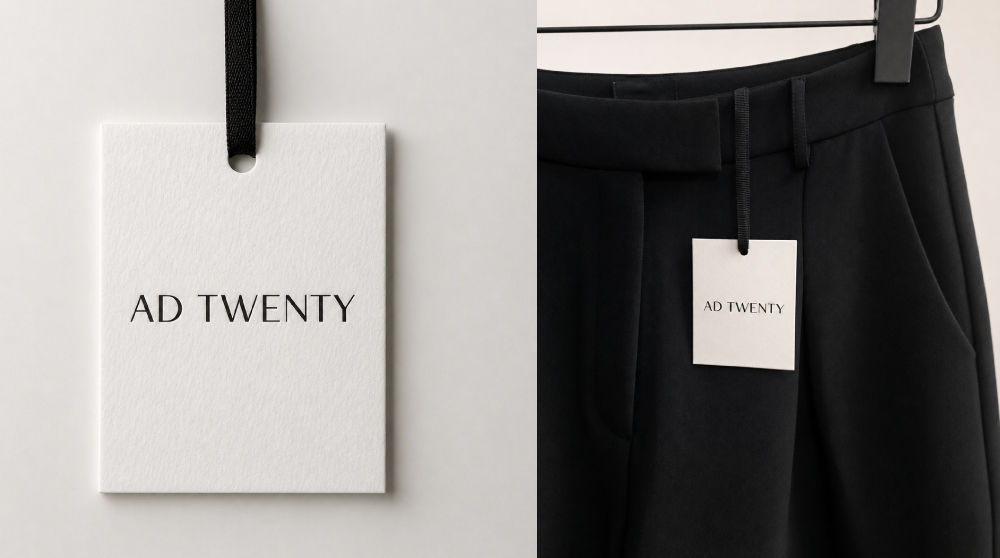
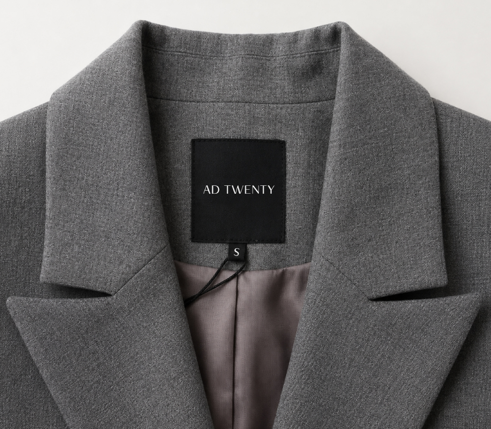
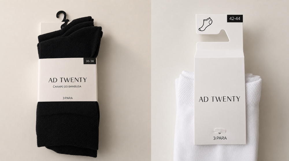
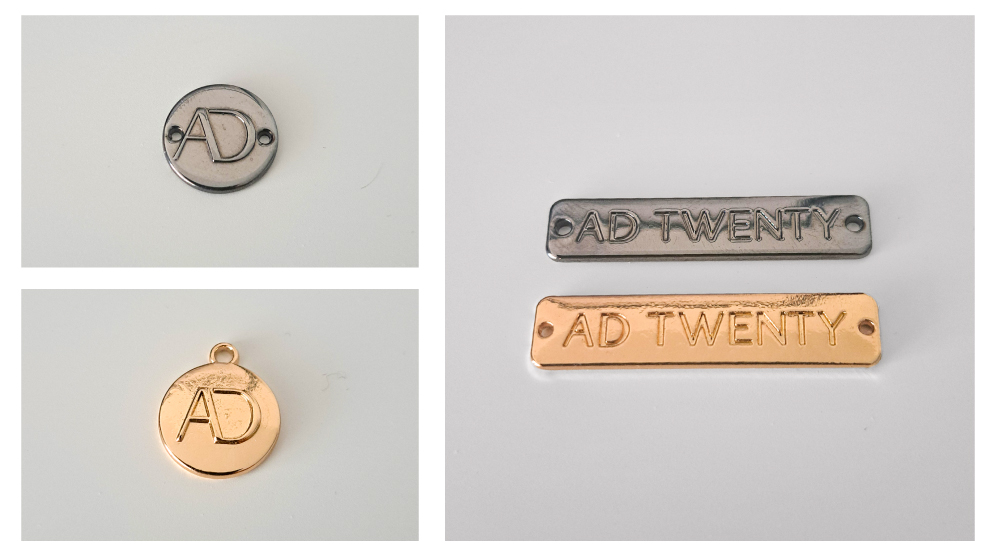
Modernise the identity without losing the familiarity built over time. The new identity needed to retain existing customers while becoming more relevant to a new audience and work more effectively across applications, from digital communication to labels, metal hardware and hang tags.
Solution
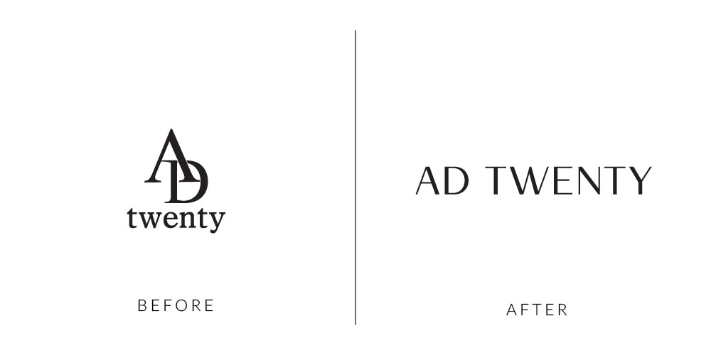
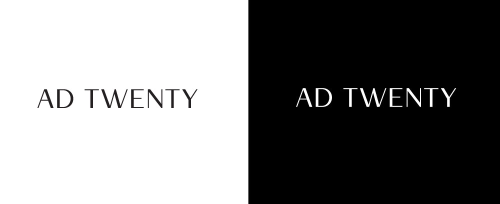
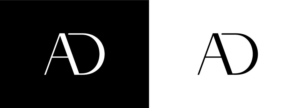
Rather than reinventing the brand, I evolved its existing character. The naturally sharp, geometric letterforms within the AD TWENTY name became the starting point for a refined, modern-classic wordmark, bringing a more elevated fashion feel while remaining recognisable and highly adaptable across physical and digital applications.

01. Identity evolution
The new identity was designed to appeal to a younger audience without alienating long-standing customers, creating a balance between contemporary fashion and timeless elegance.
02. The identity
03. Applications
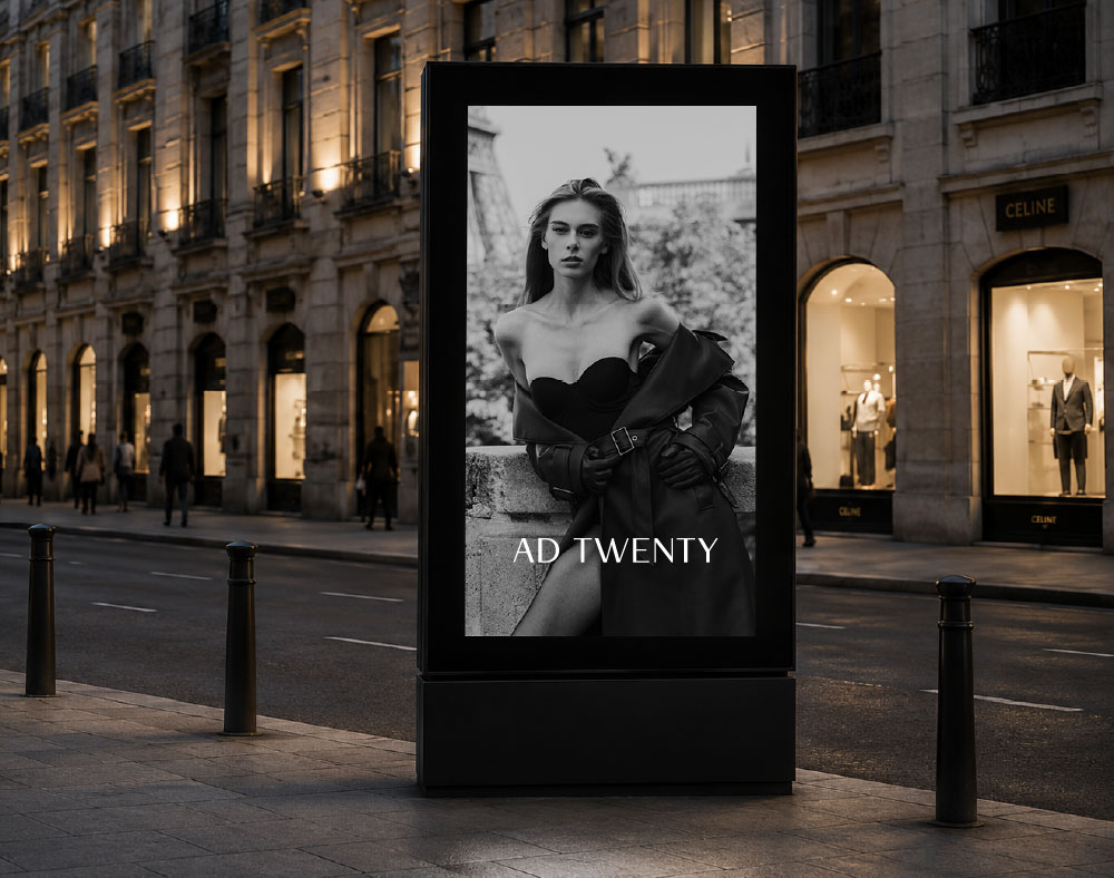
The identity extends across key brand touchpoints, bringing a subtle touch of elegance to garment labels, packaging and custom hardware while maintaining a consistent and refined visual language.